Thoughts on XDR
Findings from the 2021 12.9" iPad Pro
I recently upgraded my iPad from the 2018 11” iPad Pro to the new 2021 iPad Pro 12.9”1. I was interested in the speeds of the M1 chip, but what really got me to upgrade (and to go up in display size) was the new Liquid Retina XDR display. This 12.9” display, with a resolution of 2732x2048@2x, has over 10,000 mini-LEDs to serve as a backlight laid out into 2,596 local dimming zones. That sounds fantastic! But what does it look like in practice?
Contrast
The best case scenerio for a display is for the blacks to be truly black and whites to be very bright. an OLED display excels at the former, though sometimes fails to get bright enough (especially uniformly)2, and an LED-backlit LCD can generally excel at the latter. The mini-LED backlight on this iPad Pro does almost everything it can to do both.
Here’s a picture of the iPad Pro in a dark room, displaying an entirely black PNG3.
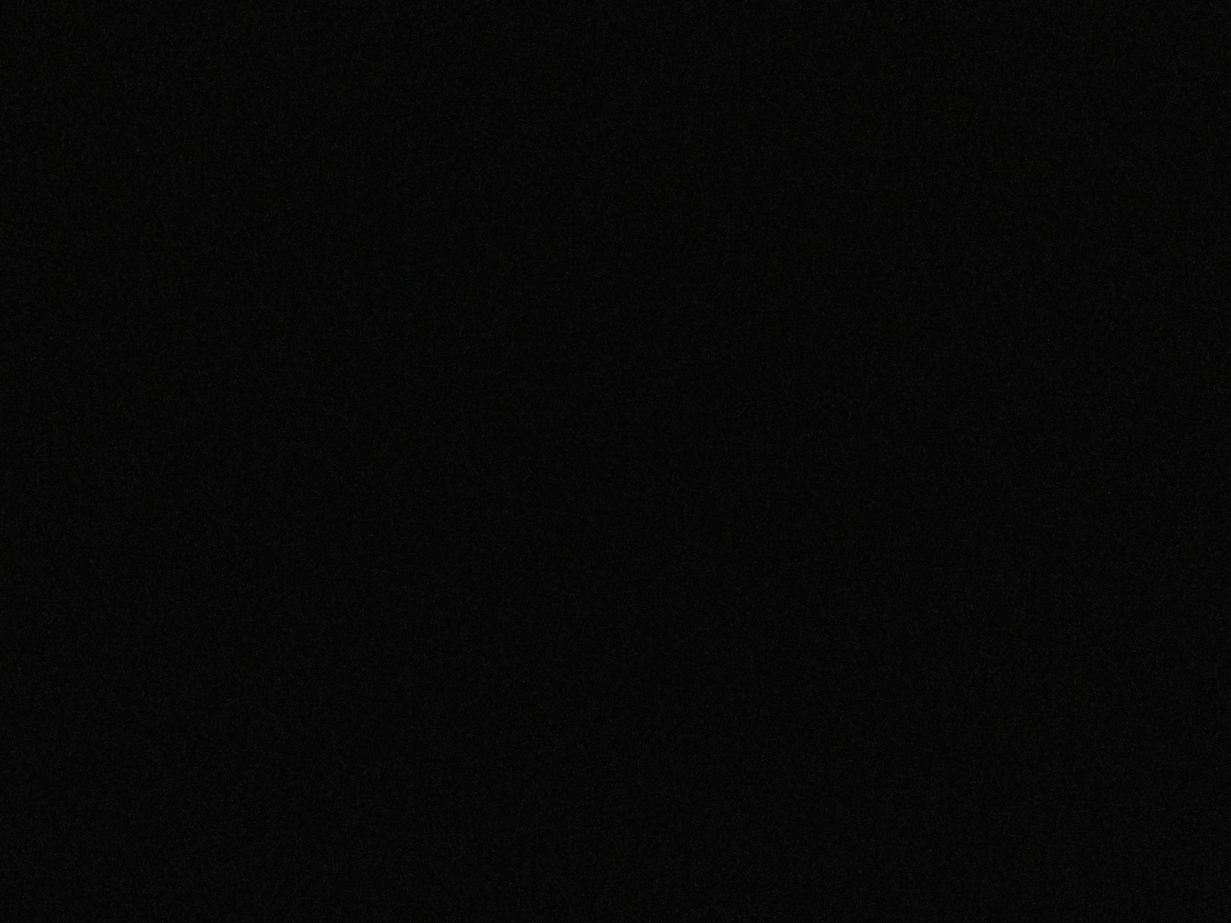
Do you see it? No? Exactly. The iPad will turn off backlight zones entirely to reach these true black levels. If I pressed the side button to sleep the iPad, it would look exactly the same. For all intents and purposes, it appears that the iPad is not awake.
If you’re in a more well-lit room, you can still tell the bezel apart from the display, as the black treatment they put on the glass has a deeper black point than the display when off. That’s true of basically every display bezel though. Nothing to be concerned about.
In actual use, you can very quickly notice that the black point is far lower than prior iPad models. Gone is most of that LCD muddiness when using dark mode. It’s just black. I’m writing this right now in Kodex with a black background, and it looks fantastic.
But it isn’t perfect.
Bloom
Because this display only has 2,596 zones to light 5,595,136 pixels, you’re inevitably going to come up against times when the backlight cannot perfectly reproduce what the display may want it to. This results in a bloom effect around objects in a scene. If you look at r/iPad, you may think that this bloom is awful and a dealbreaker for this display, but I don’t think that’s the case at all. So here’s the deal:
- If you’re in a well lit room: bloom is not a problem. The fall off of light into pure black is easily offset by the rest of the light in your environment
- If you’re looking at something that doesn’t have a true black background: bloom is generally not a problem. Maybe you’ll see some gradation in brightness, but its not nearly as stark as falling off to true black.
- Bloom is less noticable at lower brightness settings. If you crank the brightness to max, you’ll almost definitely see the effect of blooming more, as the backlight has to fall off further from bright to black.
- Larger, bright objects in a scene are not a big problem. Your eyes will naturally see a bit of a halo effect around brighter objects anyway4, so you can’t notice the light fall off.
- Light generally falls off smoothly, not abruptly. This means that you may sometimes see more of a blooming halo around something small than you may expect. I’m not sure if this is an algorithmic decision or a materials (diffuser, etc) decision, but I do kind of wish it was a bit more aggressive.
Here are some examples5 of the good and the bad. Note that the images I show are not entirely accurate to what you would see in real life, but were taken to give you a visual sense of the what I’m trying to explain. The images were taken on an iPhone 12 Pro with Smart HDR enabled, and were converted from HEIF to JPEG for display on the web.
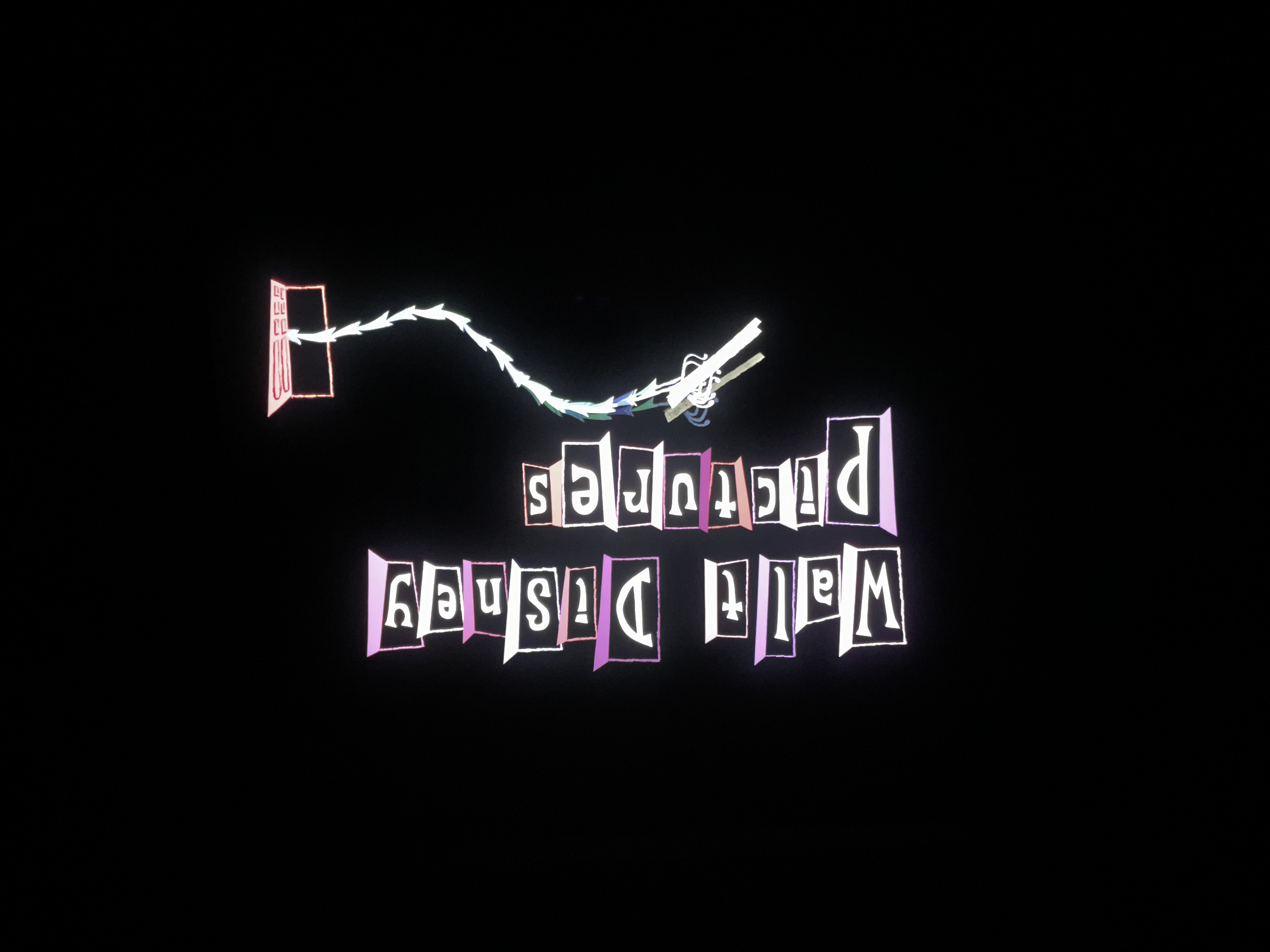
Monsters, Inc. (Disney+, Dolby Vision)
Monsters, Inc. begins with a fun animatic to set the mood for the film, and to convince kids that this movie won’t be as scary as they might think. This opening looks incredible on the new iPad Pro’s display. The blacks are truly black and the motion is quick enough that any bloom that you may notice is almost immediately gone.
Star Wars: The Force Awakens (Disney+, Dolby Vision)
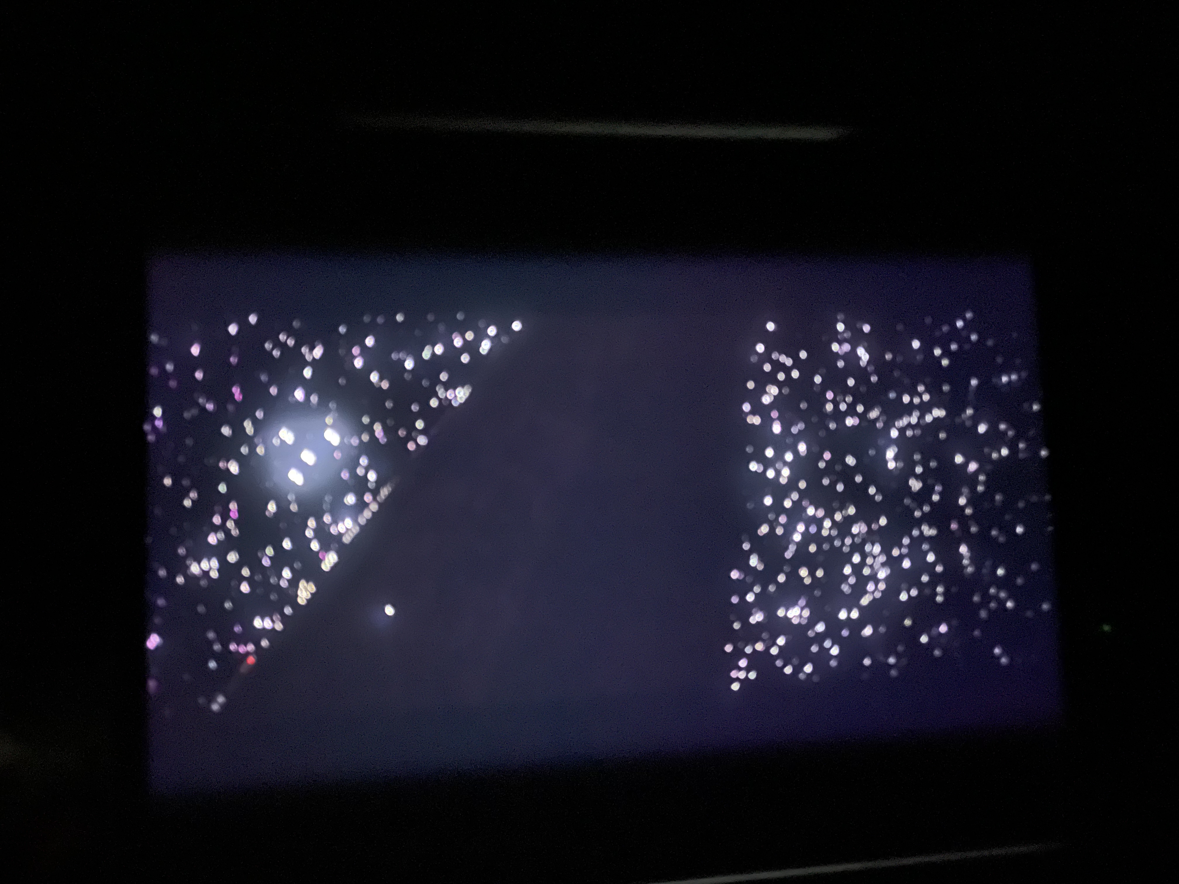
This movie shows two problems. First: it seems like the black point for this mastering isn’t quite true zero, and that it was matted into a 16:9 frame. This results in blooming around the 16:9 frame, even if there isn’t any content there. I don’t think this is a huge deal unless you’re in a pretty dark room, but is definitely noticable.
Second, this film shows significant display issues when a scene has very moody lighting. This film begins with Poe speaking with an older man. That sequence looks very bad on this display. It’s extremely muddied, making it feel almost like a dream sequence. It’s probably the biggest stress test for this display, and I think the display fails. It looks bad.
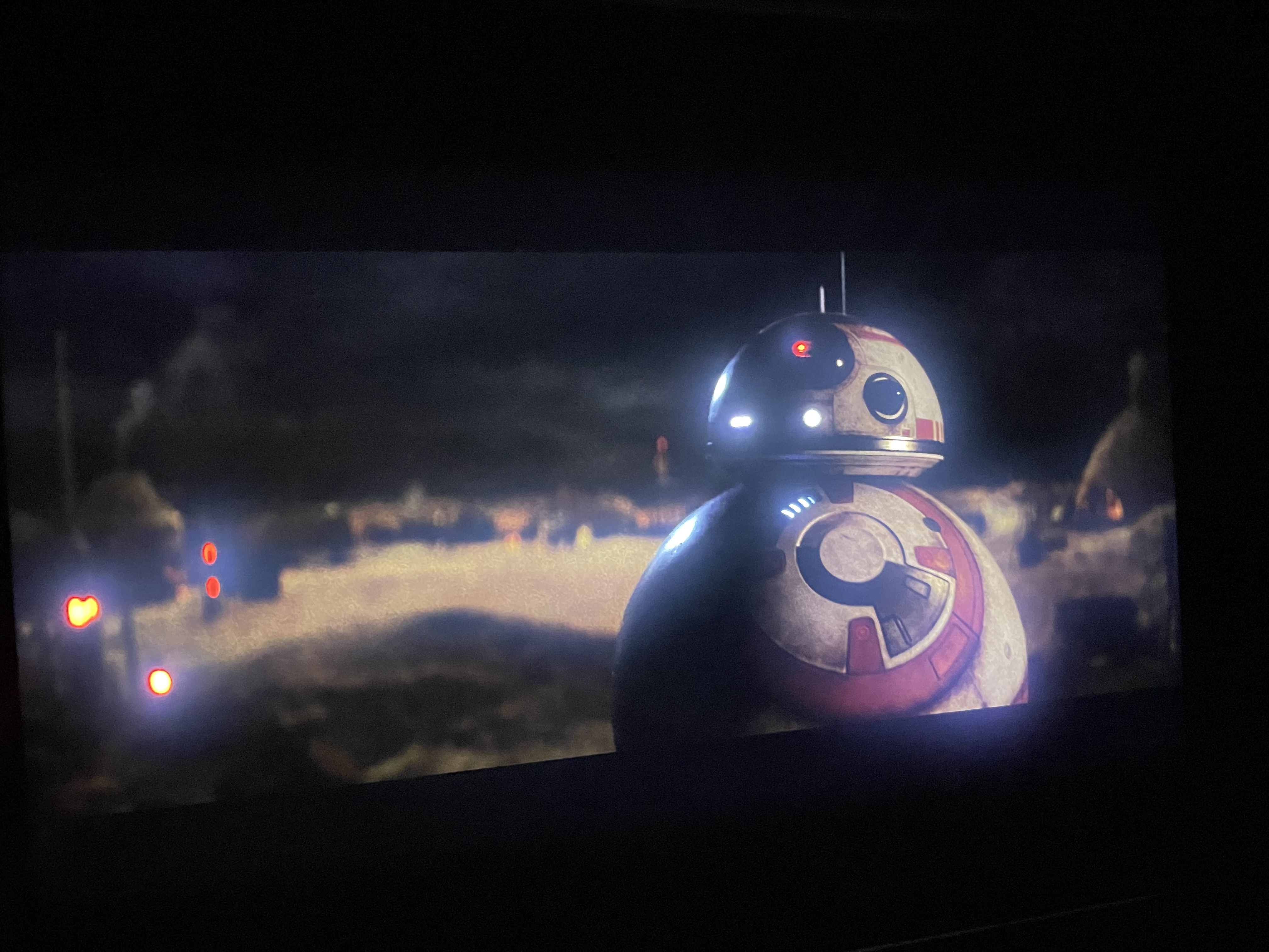
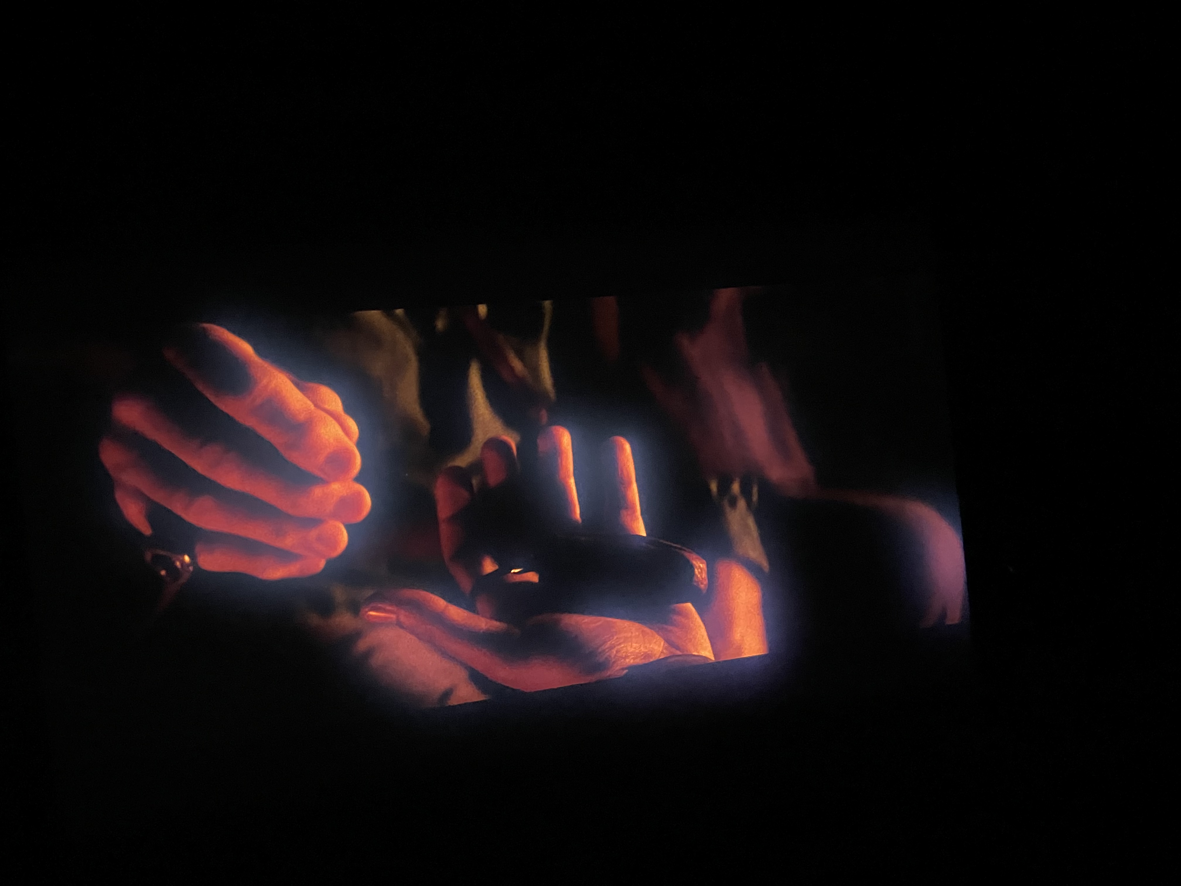
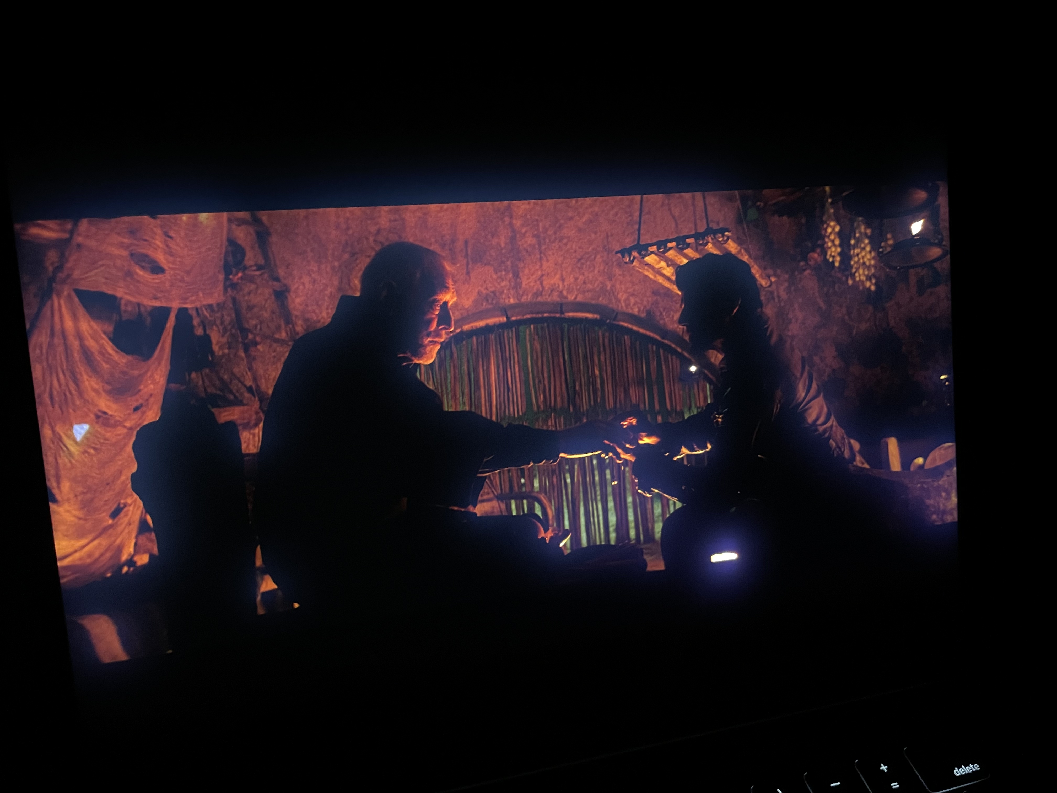
Parts of this film do look really good in HDR, though.
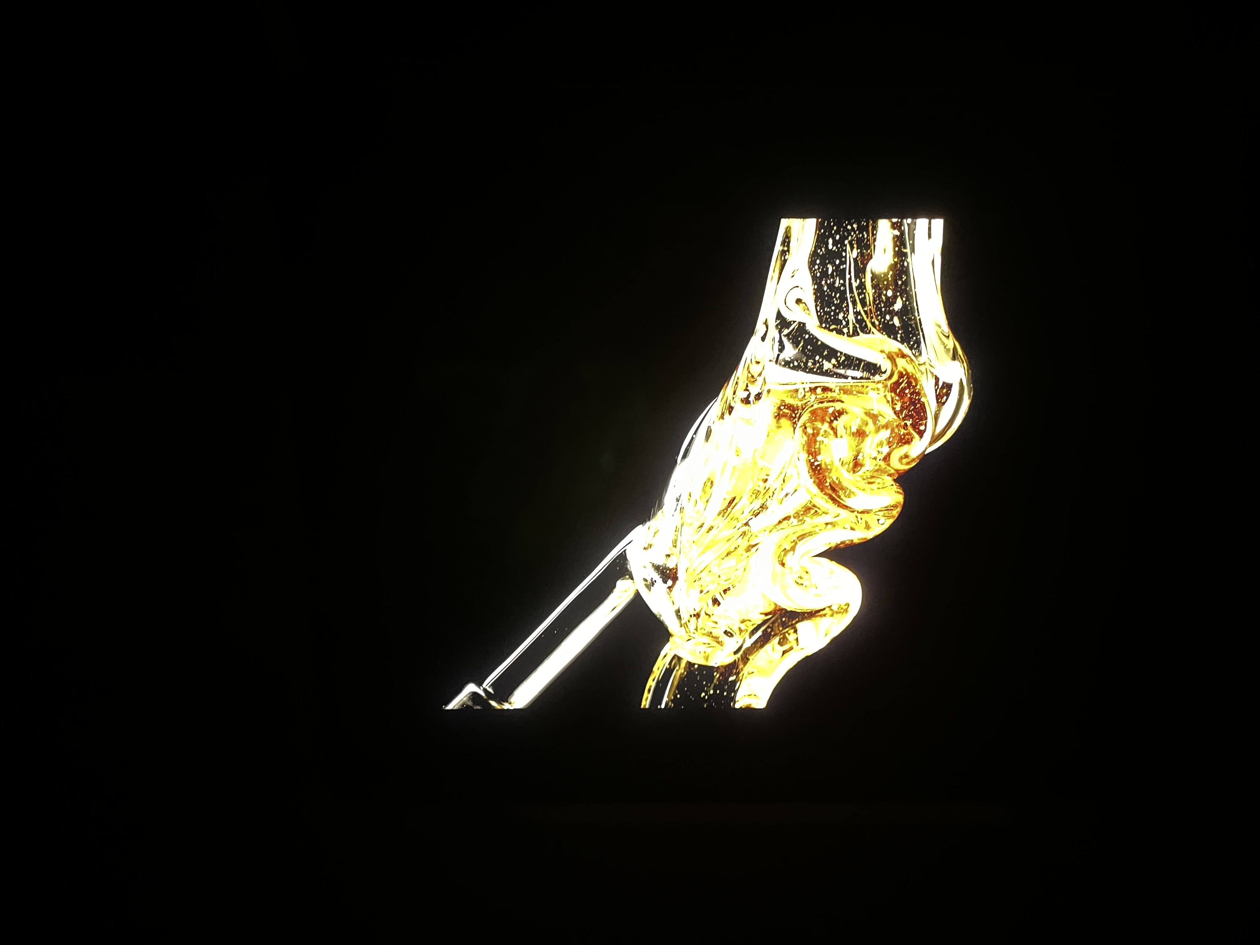
LG OLED Test Footage (YouTube, HDR)
This video was designed to showcase an OLED display, but I think it does a pretty good job at showing the benefits of this display too. You can see some bloom, especially in the opening shot, but a lot of it feels completely natural, as the objects are big and bright.
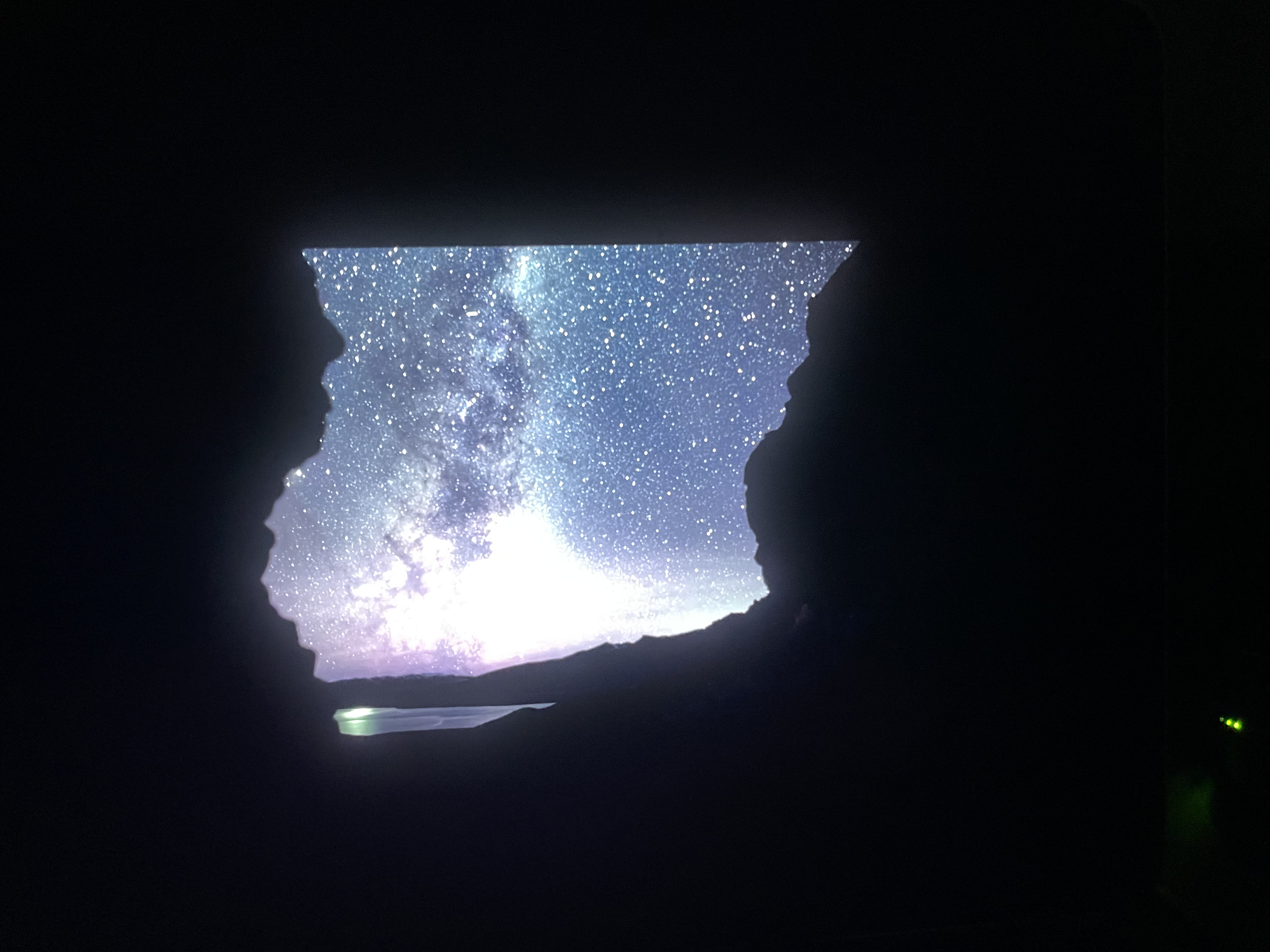
Earth At Night In Color (Apple TV+, Dolby Vision)
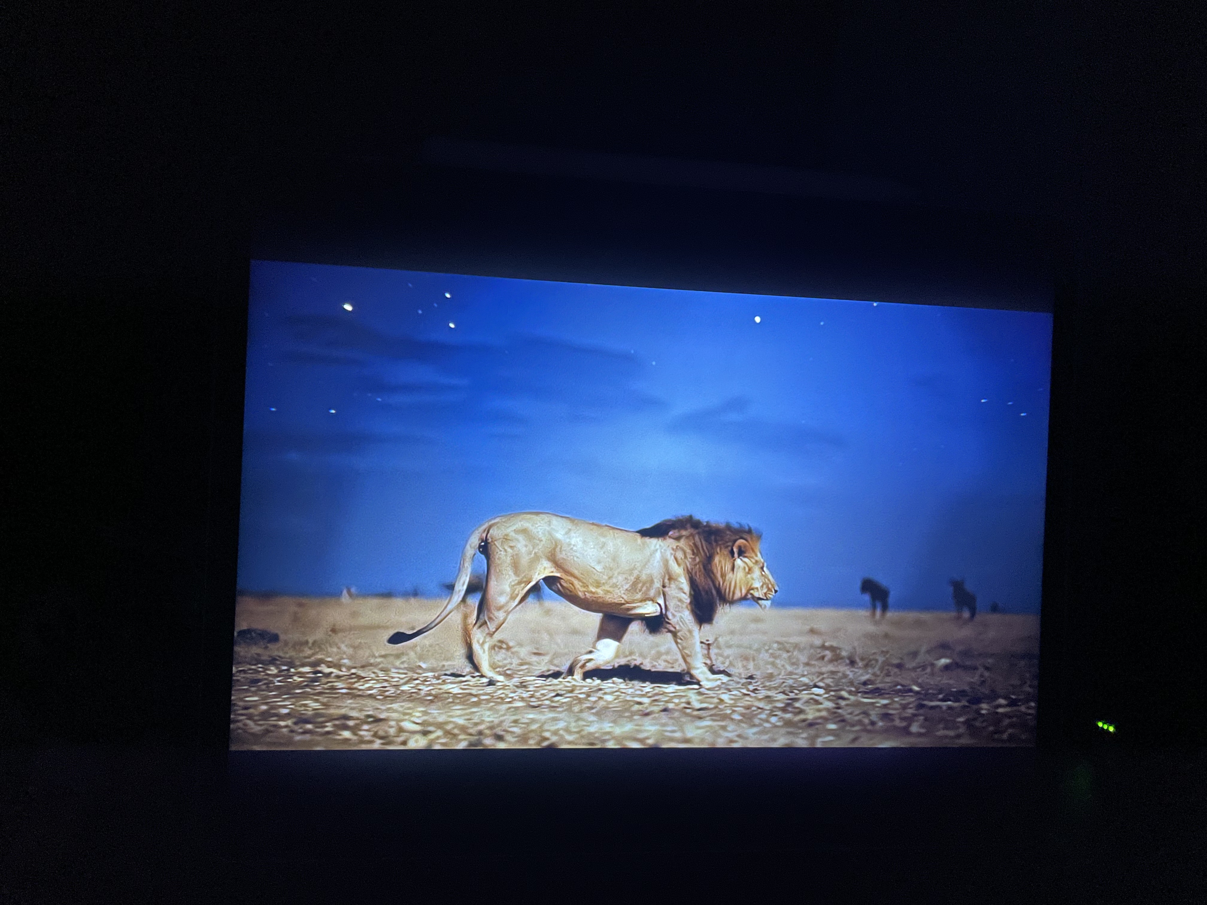
I was curious to try a nature focused show. This one is focused on using special night vision camera tech to see life in the dark. I think the blooming seen here doesn’t detract from the experience at all. It feels similar to how accent lighting behind a TV can look cool.
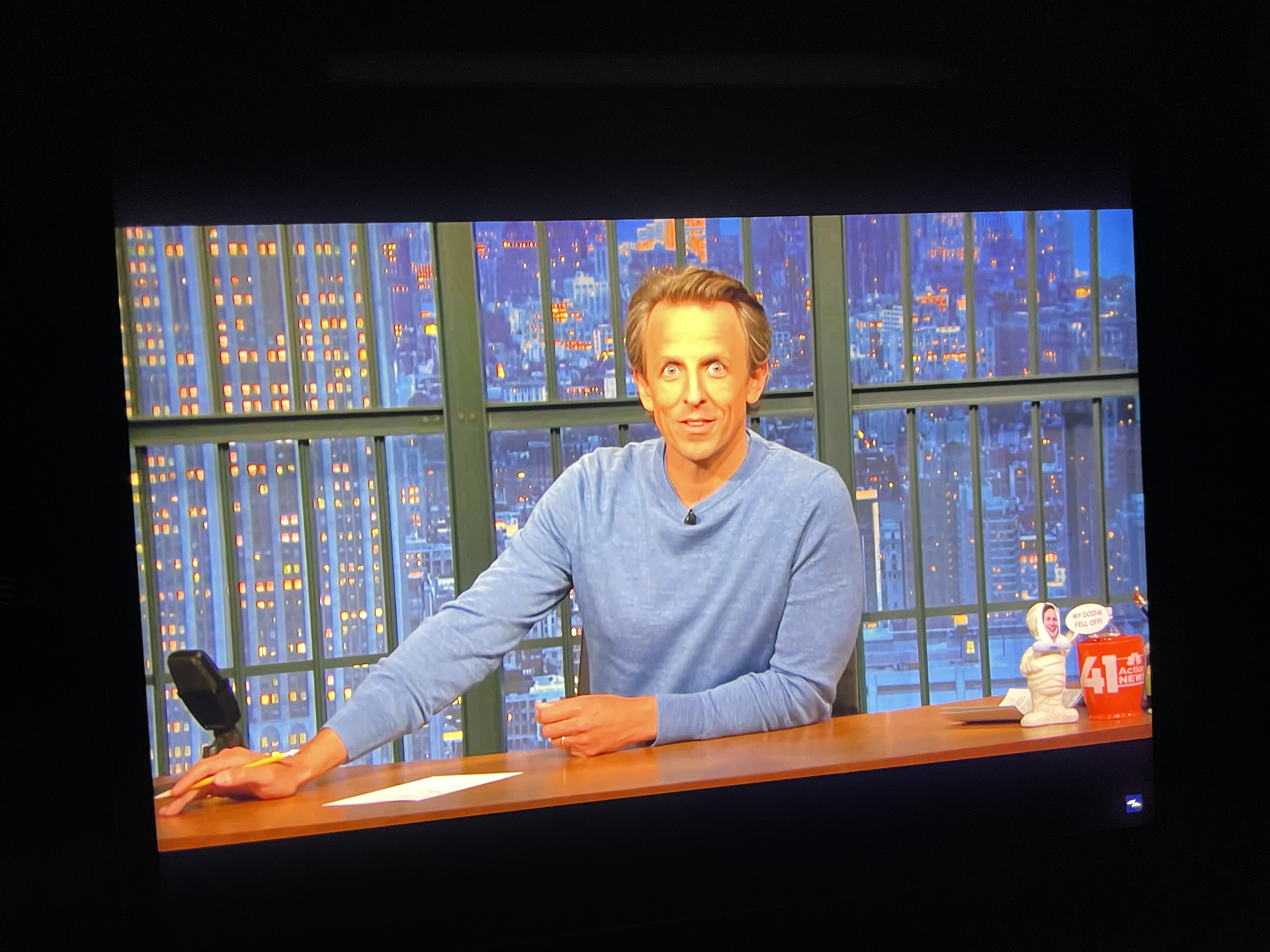
Late Night with Seth Meyers (YouTube, SDR)
When watching a Late Night clip, I noticed that the local dimming definitely had a gradient fall off beyond the 16:9 viewing window. I don’t think it detracted from the viewing experience, but I think its worth showing as an example of what the blooming can show as in daily use.
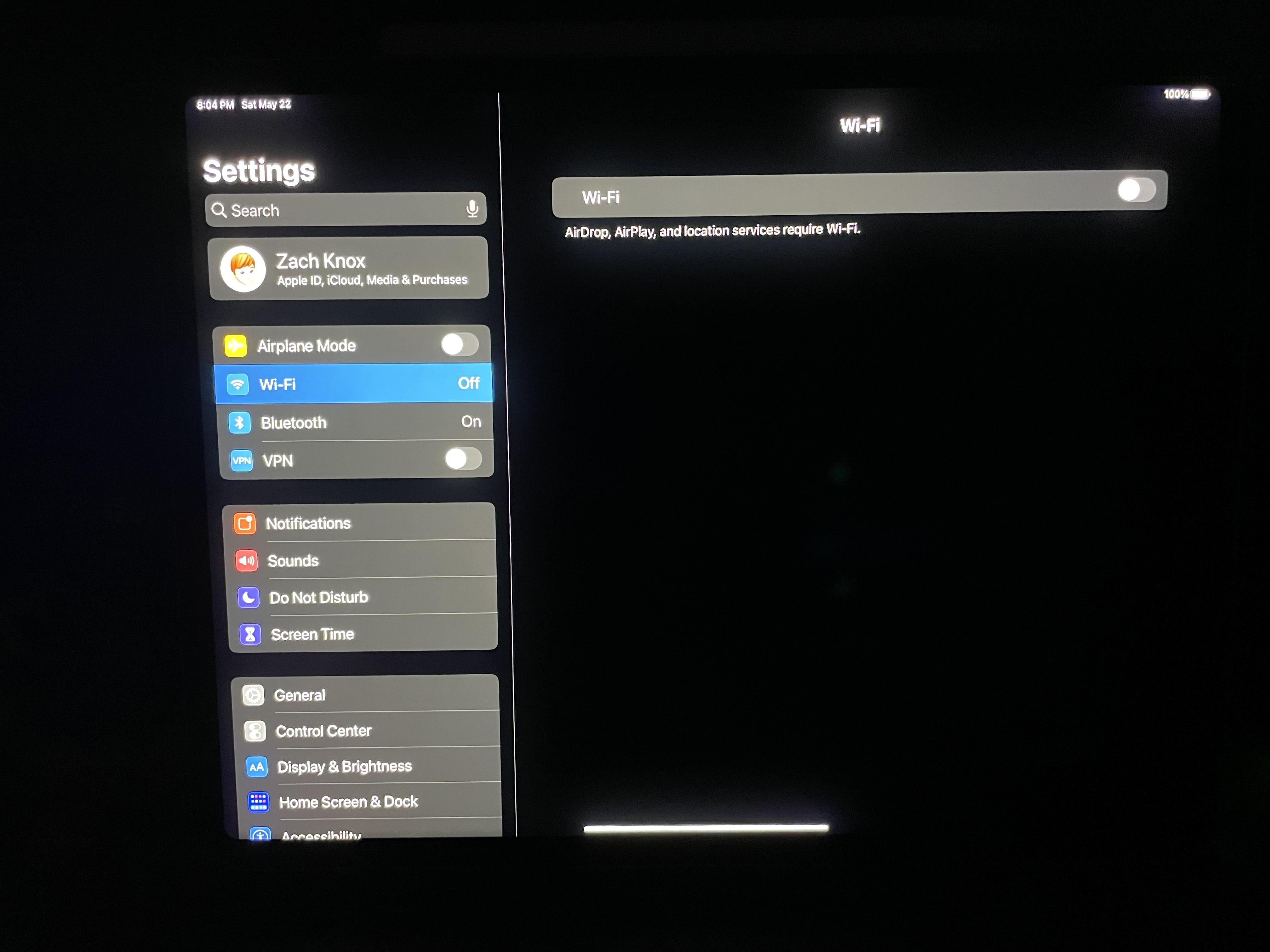
Settings App
The Settings app provides a good example of how the backlight reacts to standard UI in dark mode. There is some bloom in the corners and at the top for the text on a true black background, and a bit of bloom around each of the table view groups, but it isn’t a big issue.
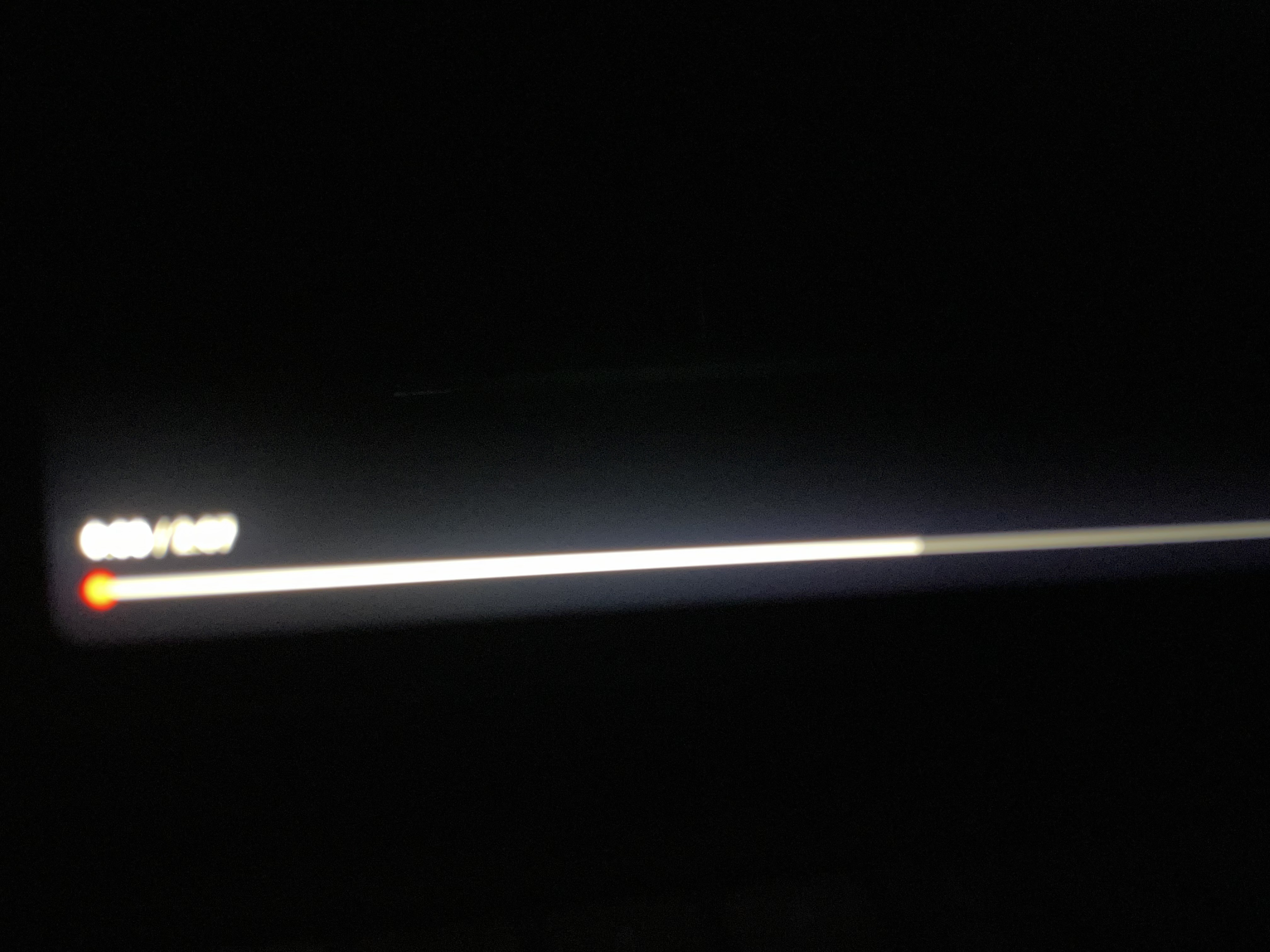
YouTube scrubber
The bottom scrubber bar of the YouTube app is a bit of an extreme example for blooming. The backlight exceeds the bar for quite a ways. In practice, this feels more like a design choice of the YouTUbe app than a real issue, but it’s definitely noticable.
Wanna see a whiter white?
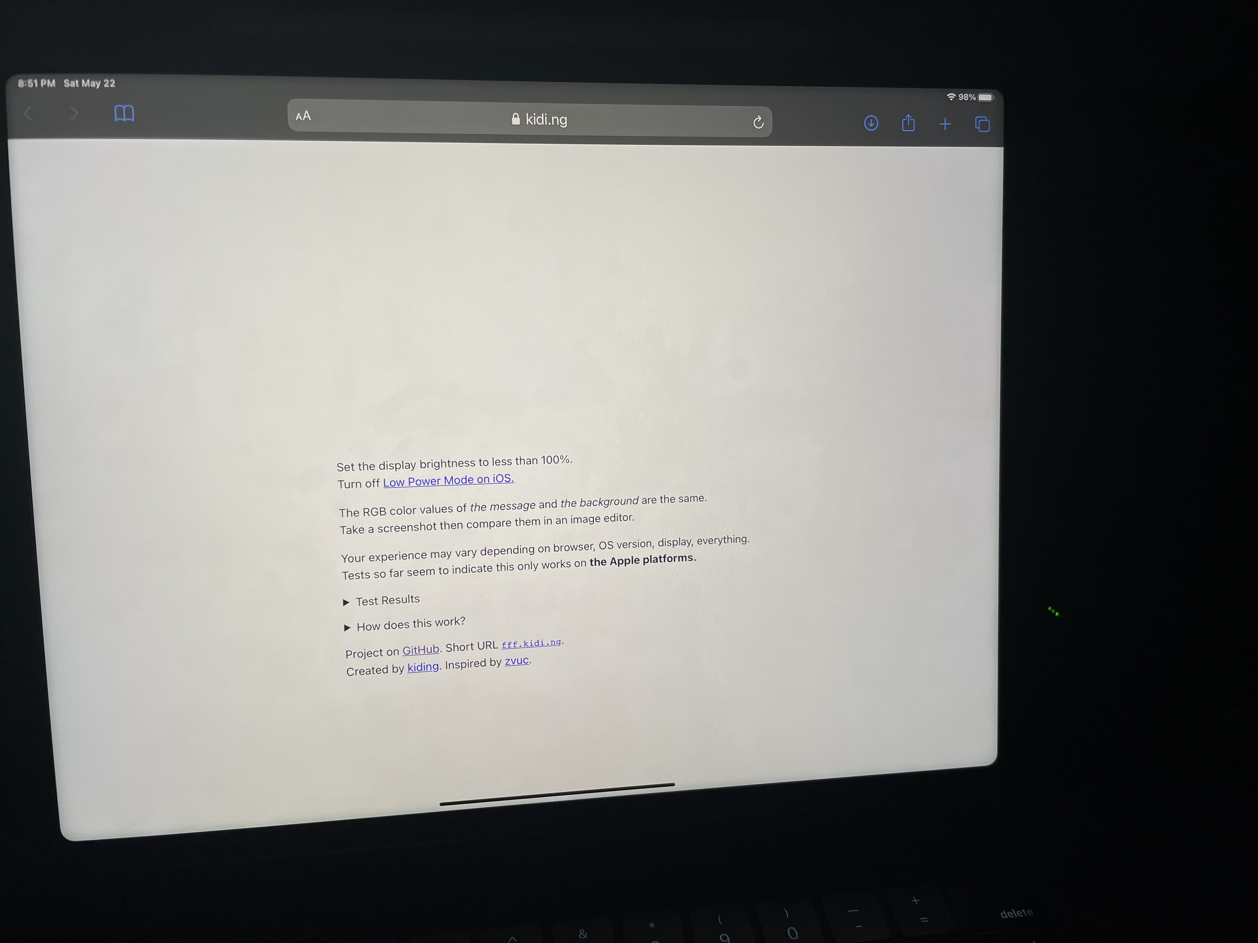
This one’s a little weird. This webpage allows a device to, for the text in the center, display at a very high brightness beyond its typical white point. It works on my 2018 iPad Pro, and truly shines on my iPhone 12 Pro. Oddly, it doesn’t seem to work at all on this new iPad Pro6.
Overall Thoughts
I think, overall, this display is very good. In most cases, it will surely improve the viewing experience of anything you’re watching or creating. But it has some clear limitations. Backlight blooming definitely exists, and should definitely be considered if you’re trying to use this iPad as a creation tool. But in daily use, in typical room lighting, I don’t think you’ll notice it very often at all.
Now if only they made this screen in an 11-inch size…
-
Technically the “iPad Pro 12.9-inch (5th generation)”. ↩
-
The latest iPhones 12 do an exceptional job at this for OLED displays. If you’re willing to watch a movie on a display that small, its a fantastic experience. ↩
-
Federico also did this in his excellent review on MacStories, but I think it’s worth showing again to really drive this point home. If you want to see this for yourself, you can download the image I made and try it yourself ↩
-
You can see this by looking at a bright object in front of a black background on an OLED display, which has no blooming. ↩
-
Most of my examples come from Disney+, Apple TV+, and YouTube, as those are services that I subscribe to which offer 4K HDR content. I’m wishing for the day that HBO Max starts universally supporting 4K HDR… ↩
-
Oddly, you can see it when blurred behind Control Center ↩